How to Enable Retina Screen-Ready Images on Your WordPress Website


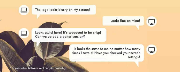
If you’ve gone from a PC/low-res laptop to a Mac in the past few years, you probably noticed something about the screen display. Dubbed “Retina” display by Mac, text appears more crisp, blacks and whites are more clear and saturated, colors are richer and more vibrant. But, in some cases – images appear quite blurry, no matter how nice they look in your Photoshop or Illustrator file. So what gives?
The “Gotcha” with High Resolution and Retina Screens
Like a grid, your monitor is made up of small squares called pixels, each pixel displaying a different color in order to make up the whole display you see. Traditional monitors have always had a minimum resolution of 72ppi, or 72 pixels per inch. Every square inch of the screen was made up of 72 pixels wide, and 72 pixels tall. This was fine, because we normally sat pretty far away from our screens, at our computer desk doing our work, meaning you couldn’t really see those large pixels. If you got really close to the screen though, you’d be able to see each little square.
Nowadays, every monitor has a much higher resolution, 100-130ppi, but the old phrase of “72ppi for web!” has stuck around. High resolution and Retina screens (Retina is just Apple’s branded name for their high resolution displays) go far beyond even that. A MacBook Pro with Retina screen clocks in at around 220ppi, and the iPhone X blows everything out of the water at 458ppi! But what do those numbers really mean? The answer to that is also the reason why some of your images might look blurry or pixelated on a Retina screen: they pack more pixels closely together in a single inch, making the image appear smaller on these screens. For example, an image which is 100px wide will be about an inch wide on a normal ~100ppi resolution screen, but on a 200ppi Retina screen will only appear to be a half inch wide: more pixels in the display, smaller image.

Remember this old thing? Ye Olde Macintosh Plus with a true 72ppi screen, ca. 1986
But it doesn’t end there. The makers of these new monitors don’t want you to view tiny websites all the time, so they scale up the size of those objects to match the approximate 1″ length of a traditional screen, essentially “stretching” the image to fit the larger space. (You can change this view in your monitor settings, but many people don’t.) And the result of the monitor stretching the image to fit the larger size, means that the photo gets blurry because you’ve essentially zoomed in farther than the image expected you to. If you’re looking for an explanation on the history and intricacies of how Retina screens work, please take a look at this Quora explanation – and if you’re coming from the print world, check out this excellent article on the difference between dpi and ppi.
What This Means for Site Owners
I’ve always worked on a standard monitor with standard display. But after I got a MacBook with Retina display, it was annoying to see so many images and logos on the web suddenly looking blurry. As a DESIGNER, who always saved my Illustrator or Photoshop images in the same way, it was absolutely confounding that for some reason all my images now looked blurry on client’s sites.
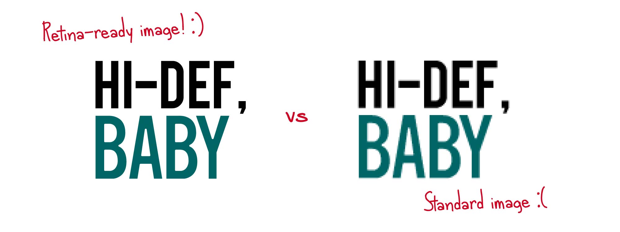
A standard image looks bad on a high resolution screen, but the Retina-ready version looks clear and crisp!
Obviously, everyone wants their site to look the best it possibly can. Blurry, pixelated photos are the mark of an amateur website, and to look professional, images need to be clear and crisp. Fortunately, the fix here is a pretty simple one – save images that are larger than what you actually need, and serve those larger images to high res and Retina visitors!
Simple, right? Although, there are those pesky old issues of “how do I know when a visitor is on Retina?” and “how do I tell my website to send them the larger image?” While there are definitely manual programming ways to accomplish this, WordPress has an excellent plugin to manage this and automate the whole process for you: WPRetina2x.
Enter the WPRetina2x Plugin!
WPRetina2x, a plugin by Jordy Meow, automatically creates 2x size versions of your images, and adds them to WordPress’ responsive image functionality.
The WPRetina2x plugin automatically creates larger image sizes to display on high resolution screens
As you may know, 4.4 WordPress updated the way it handles responsive images, so smaller images now get served for mobile devices. This helps mobile users to avoid heavy load time and save bandwidth when they access your site. While WordPress did a great job of solving the mobile downsizing issue, it failed to address the Retina issue, which requires upsizing the image.
There is a decent reason though: many times, people upload only the image size that looks right on their screen, or fits their layout. You cannot resize a jpg, png or gif image to be larger and still look good. So the solution is to save your image at a larger size than you need, and allow WordPress and the WPRetina2x plugin to create all the image sizes automatically.
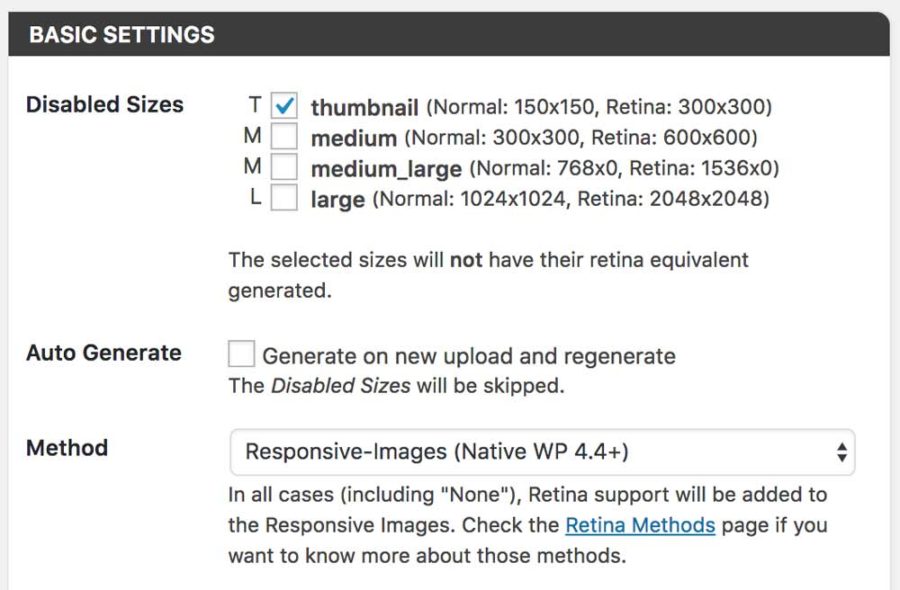
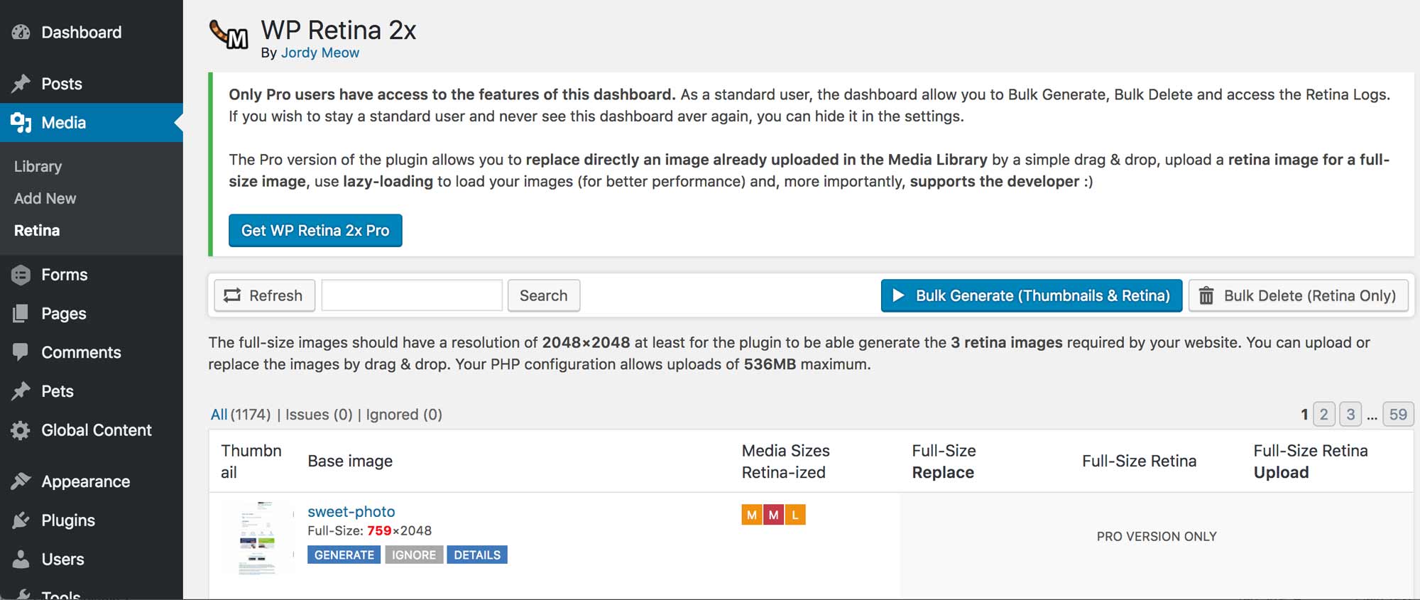
WP Retina 2x Plugin Basic Settings
To do this, go into the plugin settings and configure it to your liking. You can disable the generation for some sizes (for example if you are not using thumbnails) to save storage space on sizes you will not use.
WP Retina 2x uses a number of different ways to detect and serve the images to high res users, and you can choose the method here. Depending on your theme and plugins, one solution will be better for your site than the others. Head over to the Retina Methods page to learn about these different cases and find the best one for you.
Then, navigate to the Retina tab inside the Media Library menu. Here you can see all of your images, and their Retina-ready status. As is the case with many plugins using the “freemium” model, the free version of the plugin is good – but the paid version is better and will do everything you want. (Check out the WP Retina 2x Pro website for pricing information on yearly and lifetime licensing.)
The WP Retina 2x generation shows the bulk generation progress and tells you what size to upload your images for optimal Retina display
Once you’ve started using the plugin, you can easily see the double-size image(s) it has created inside your uploads folder: its naming convention is a bit different and includes @2x at the end. If you’ve gone the Bulk Generation route, every image in your Media library will have these additional sizes available.
As high resolution screens become the norm, I imagine that Retina support will be native in WordPress core, but for the time being you can easily get your site Retina-ready with a free plugin and all your users can enjoy crisp, clear imagery on your site like it was intended!